Up until 1958, road signs in Britain were mostly a slapdash series of roadside posts of various sizes, colours and type fonts. Originally, these early signs were designed to be read by the drivers of horse-drawn carriages, and later by early, slow motorcars.
As technology advanced and cars became quicker, it became increasingly difficult for drivers to identify and accurately read the mish-mash road signs. Things became so bad, in fact, that the design magazine Typographica published two essays condemning the signs’ terrible nature at the time.
An answer came courtesy of a government intervention, with ministers hiring two London designers, Jock Kinneir and Margaret Calvert, to devise a new standardised signage system for the roadways.
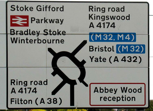
Assuming you’re not severely visually impaired, you’ll be familiar with Kinneir and Calvert’s work. After all, you more than likely see them every single day of your life, and the chances are that you’re no more than several feet from one right this second.
If classics are measured by their longevity, then the Kinneir-Calvert system is a classic in the truest sense of the word. Not only has it been in constant use since the late 50s, it also inspired and informed a number of other, similar projects around the world.
This year, an exhibit about the two designers has been organised at the London Design Museum by designer Patrick Murphy, and an accompanying book called Redirections is due out later this year. The first time that anyone has recorded the Kinnier-Calvert project for posterity, it’s a little surprising that it’s taken this long given how pervasive the signs have become.
“People experience these things more than luxury design, but it’s not like Apple with Jonathan Ive. People don’t know Calvert and Kinneir as designers,” Murphy says.
The 1950s also marked the decade that the automotive industry started to manufacture cheap, more widely affordable cars. Suddenly, it became more cost-effective for families to ditch the railways in favour of a car, which caused traffic in the UK to surge.
Massive construction projects, which would eventually birth the first true motorways in Britain, were started to cope with the swell in traffic, with drivers now needing to be able to read where they’re going faster than before. Clearly, the rickety old signs of yore just wouldn’t cut it.
Kinneir and Calvert were the obvious choice for the job; just a few years previously, Kinneir had won his first job creating signage for the then-new Gatwick Airport after serendipitously meeting the airport’s architect in a queue for the bus.
Back then, wayfinding systems weren’t a thing, and Kinneir had to more or less invent the entire signage system from the ground up. Other jobs soon followed, and ultimately led to a commission from the Ministry of Transport.
The government specified only two things for the brief: what do you need to know while travelling at speed, and at what distance do you need to know it? Calvert later wrote in an essay published by the Design Museum that: “Style never came into it.”
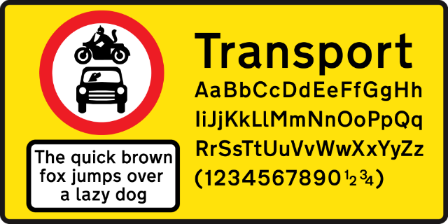
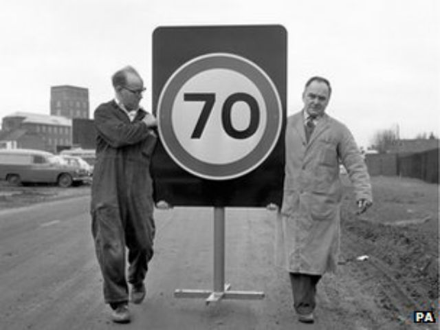
Instead, function was emphasised over form, and the signs had to display easily-readable forms that could give drivers information immediately. New materials like the reflective coating used on the signs certainly helped, but the pair of designers had to create their own typeface from scratch.
In an accompanying publication Calvert wrote for the project, she explained: “Important details, such as the curve on the end of the lowercase l, and the obliquely cut curved strokes of the letters a, c, e, f, g, j, s, t and y, were specifically designed to help retain the word shape of place names when slightly letter-spaced. This specific letterform, after two attempts, and in two weights, was officially named ‘Transport’”.
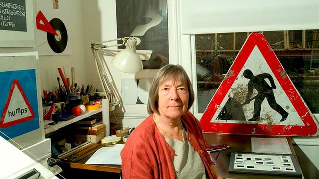
Born in South Africa, Calvert moved to England in 1950, where she studied at St Paul’s Girls’ School and the Chelsea College of Art. Kinneir, her tutor at the college, initially asked her to help him design the signs for the Gatwick Airport project, where she chose the black on yellow colour scheme after researching the most effective colour combination.
When Kinneir was appointed head of signs for Britain’s roads, he hired Calvert to design the signs. She masterminded the simple, easy-to-understand pictograms which at the time were revolutionary, including the signs for ‘men at work’ and ‘farm animals’, which she based on a cow named Patience that lived on a farm near where she grew up.
Along with the typeface and the images, Kinneir and Calvert also created rules for the traffic signs that continue to be used today. For example, the wide gaps in letter spacing is derived from research the pair conducted on how type should scale according to the speed of the traffic passing it. For the road signs, the unit of measurement for spacing is based on the width of a capital I, a consistency which the designers say helped foster a sense of familiarity among drivers.
Calvert, now 79, said: “It required completely radical thinking. The information wasn't there in terms of reading distance, clarity and letter spaces. We had to make up the signs and then test them. It was instinctive.”
It’s not just the content of the signs used that was experimental; even the methods used to test them were, at the time, unheard of. These methods came in handy when, in 1959, a rival designer named David Kindersley petitioned to use his own typeface on road signs instead of Kinneir and Calvert’s.
Kindersley’s used an all-caps typeface with serifs, which had been created specifically for black-on-white signs, the same high-contrast combination used for the British road signs. Managing to get enough attention, Kindersley was soon pitted against Kinneir and Calvert in a battle to be the brains behind the roadways’ typeface.
To assess which was the better, the Road Research Laboratory hired several airmen from Benton airport in Oxfordshire, seating them on a tiered platform in the middle of an airfield. A car was driven towards them at various speeds, bearing signs that featured Kindersley’s font, Kinneir and Calvert’s lettering and the old-style writing for good measure.
Ironically, Kindersley’s signs proved to be three per cent more legible than Kinneir and Calvert’s, but the researchers deemed it to be a negligible amount and the ultimate choice was decided upon appearance rather than out-and-out legibility. In the words of one observer: “Kindersley’s letters were just so ugly”.
Despite Kindersley’s best attempts, the road signs created by Kinneir and Calvert have endured as some of the most classic designs in history. Very few people have heard of Calvert, but her portrait is probably more recognisable than even the Queen’s: the girl in the ‘school children crossing’ sign is based on a picture of herself.
Design commentator Michael Czerwinski says: “We do not question them like modernist buildings and they have not been dabbled with as much as other things have.
“The fact they are still in use today says a lot about the success of the designs. By keeping it simple, it stands out and doesn't age. It is still informing people more than 50 years after it was created.”
For more, Kinneir and Calvert’s designs are now available to view in the London Design Museum. Or, you know, on any of Britain’s roads.


